
Notes # 18: Netflix, Judicial Services In China, FIFA World Cup Fonts...
Created while listening: Mumford And Sons – Prizefighter
Personal Notes
This weekend, I was in my hometown, Bursa, with my family. We went to a shopping mall to buy some clothes and came across a huge foyer area on the first floor. This was the “Hot Wheels Foyer” There were dozens of booths, thousands of small Hot Wheels cars, and, of course, many children in the area. I am not a Hot Wheels fan, but I knew from a friend that they had produced a car with Braille label. So, I decided to ask a salesperson about it. Since we were in a small shopping mall in Bursa and there were many children who could be better customers than me, my expectations were very low. Also, I didn't expect the salesperson to know what “Braille” is.
But everything went very smoothly. I asked a salesperson about the Braille-labeled car; he understood what I meant immediately and started to search for the car. After a few minutes, he found the model at the bottom of a basket. The package was Braille-labeled, and there were also Braille labels telling the model of the car on the side panels and under the car. Implementing accessibility not only on the packaging but also on the product itself is a great idea.
News
Netflix Enhances Accessibility With New Language Search Features For Subscribers
Source: Yahoo
“According to Netflix, nearly one-third of its subscribers use accessibility features while watching movies and TV shows.” With these insights, Netflix started to allow subscribers to search not only by a show's original language but also by available accessibility options, including subtitles, dubbing, and audio descriptions. Rather than including an “accessible content” category and putting it at the end of the menu, updating the "search by language" feature is a more inclusive approach. Also, this is great news showing the importance of universal design and its benefit for all. By the way, I couldn’t see this feature in Netflix Turkey.
Judicial Services Made More Accessible To Nation's Persons With Disabilities
Source: China Daily
The ongoing partnership between the Top Court of China and NGOs working in the field of disability to increase the accessibility of judicial services is showing its impact. Through this partnership, the Top Court has created several fast-track services. For example, when a deaf person arrives at the court, they can use writing tablets and voice-to-text software, and the court provides assistance to prepare their case. A professional sign language interpreter can also be arranged with the help of NGOs. In this article, you can read about a case showing why assistive technology and sign language interpretation are important in every field.
Report Highlights Travel Websites’ Accessibility Issues
Source: Selling Travel
According to a study by Nexer Digital, 87% of disabled consumers are unable to complete a typical retail journey independently on travel websites. Some of the widespread issues identified include inaccessible content (62%), confusing navigation and pop-ups (55%), and difficulties progressing through browsing stages (79%). Furthermore, CAPTCHAs and verification tools at checkout are among the most inaccessible steps in the process, affecting 81% of users. On the other hand, only 4% of participants report the accessibility issues they encounter. So, what is the impact of the EAA after one year? I haven't seen a big movement in the field. The only change is that more people have started to talk about accessibility, which is a small gain, honestly. However, we have not yet achieved what we expected.
Inspirations
The Web Is Being Made Accessible For AI, Not People
Source: Tech Policy
A great article on some disturbing facts in the age of AI. Like most people, I also believed that there is a significant overlap between what AI agents need and what screen reader users need to navigate a web page. “However, this overlap is narrower than it appears. Screen reader users require not only plaintext, but also structure: heading hierarchies that allow jumping between sections, landmark regions, descriptive link text, and alt text for images.” In contrast, for AI, plaintext alone is sufficient. Therefore, designing for AI does not inherently mean designing for accessibility. Unfortunately, as an obvious fact, everyone tends to prioritize AI over accessibility. This can be defined as the “reverse curb cut effect”. To read more on this discussion, you can check out the article.
Partial Accessibility Is Sometimes Worse Than No Accessibility At All
Source: Access Ability
Sheri Byrne-Haber (disabled) has summarized some common failures made in the planning phase of an accessibility program. Under the name of “prioritization,” we sometimes miss critical points that result in partial accessibility of the product. You may have made most of your product accessible, but have you tested error states, the mobile site, or PDFs? In this article, you can read about some frequently overlooked states and flows, and perhaps evaluate your digital accessibility program again.
UX Learnings from FIFA’s Font Fail
Source: Pimp My Type - YouTube
If you are interested in UX and typography, check out Oliver Schöndorfer's videos and newsletter. In his latest video, he reviewed the 2026 FIFA World Cup font and its usage. His main point is that the problem lies not with the font itself, but with how it is used. For example, a bold and ultra-condensed form should not be used in small text. In the video, you can see more screenshots and funny moments combined with valuable UX lessons.
In Detail: Norway Font For The 2026 FIFA World Cup
Read this article on its own page
I was watching the Ivory Coast vs. Norway match and something caught my attention more than the football: The font on the Norway shirts. It is definitely unusual, different, and eye-catching. Usually, I react negatively to unconventional fonts; I find them hard to read and can never get used to them. However, Norway's font felt geometric, sharp, and simple to me. The more I looked at it, instead of thinking "how hard this is to read," I started thinking "actually, this is a great idea."
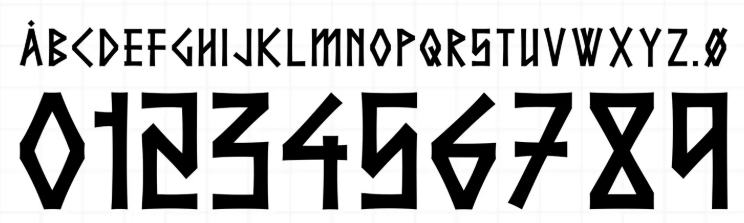
As I dug deeper, I found out that this powerful and characteristic font is rooted in Norwegian traditions. In other words, it’s a font with a story. Norway made a similar attempt back in 2024, but the readability of that font was quite poor. In the image below, the one on the left is from 2024, and the one on the right is from 2026.
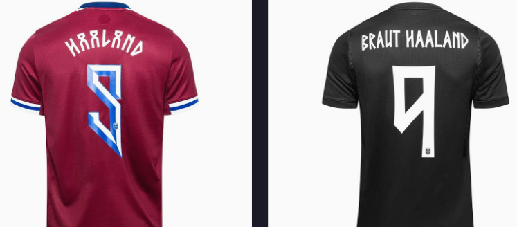
After the 2024 version drew a backlash from FIFA, they simplified it for the 2026 font to make it more legible. I found this simplification to be both powerful and readable. What do you think?
Get Each Issue By Email
New notes, news and an album recommendation, straight to your inbox. Free, and you can unsubscribe anytime.
You will get a confirmation email first. Subscriptions are handled by Buttondown.